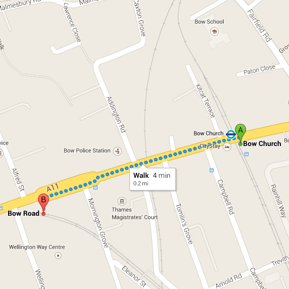
London Layout

Alternative maps for London transport

Facebook link for London maps page Pinterest page for alternative mapping Tumblr blog on Crowdfunding


London Layout logo

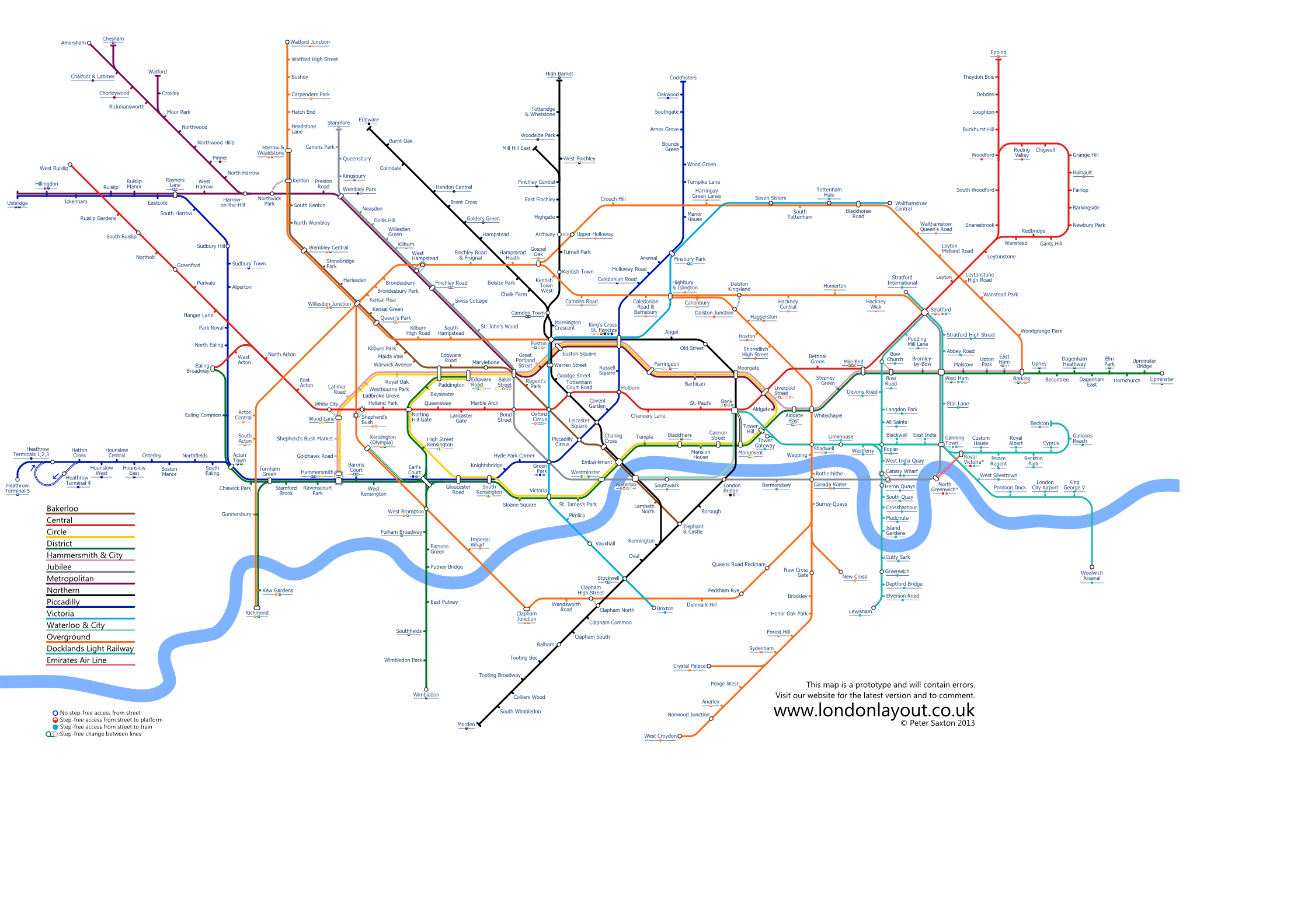
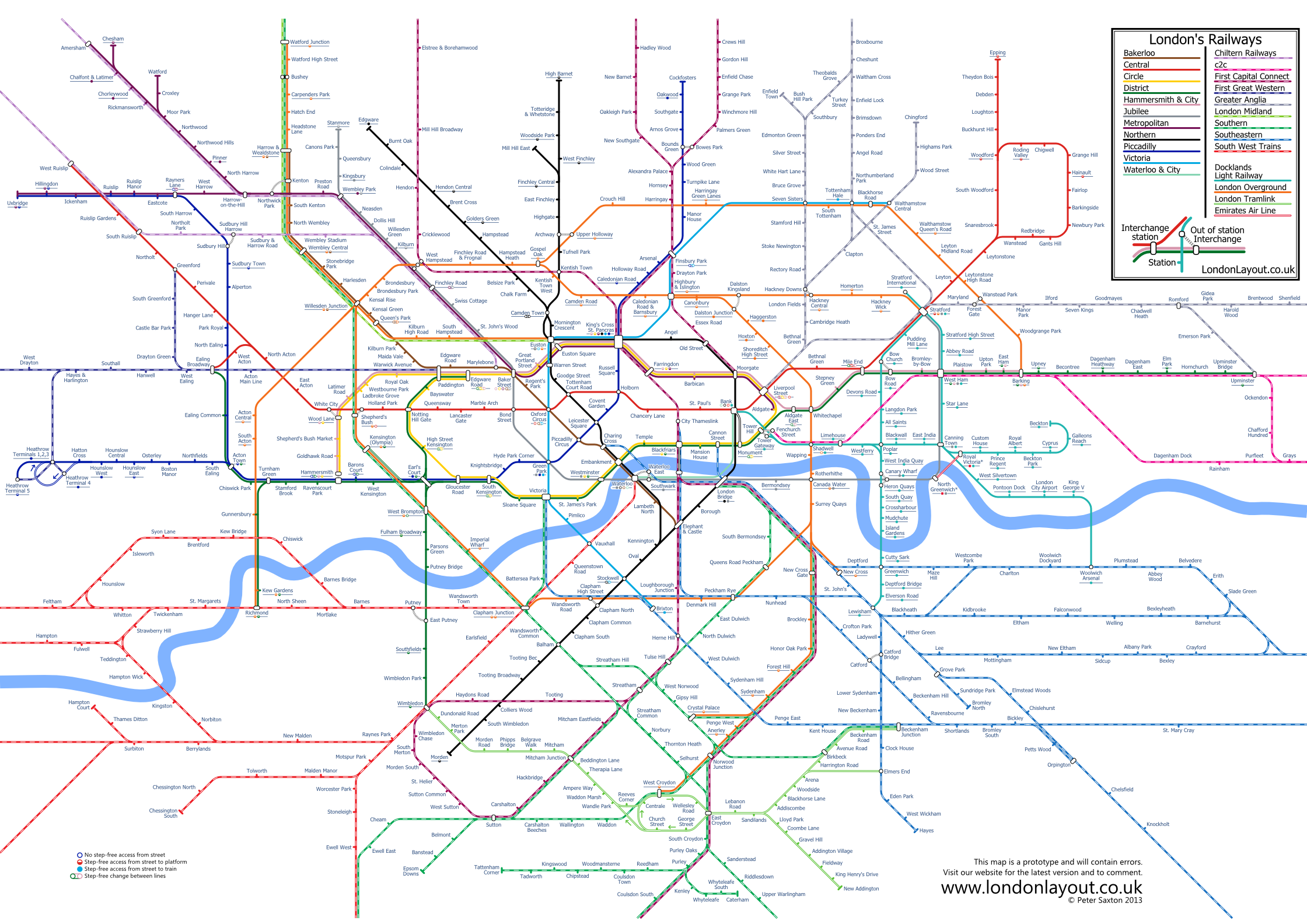
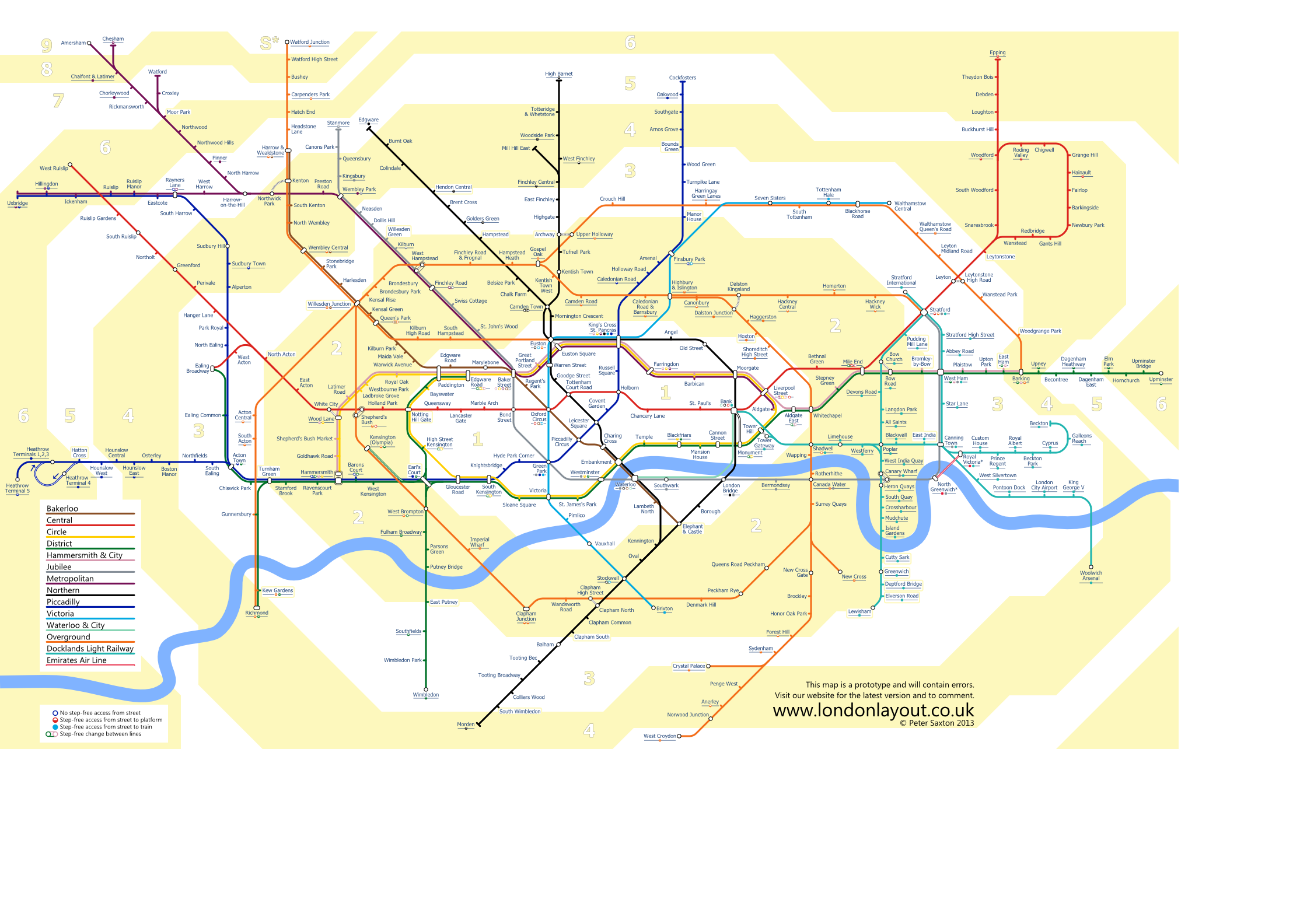
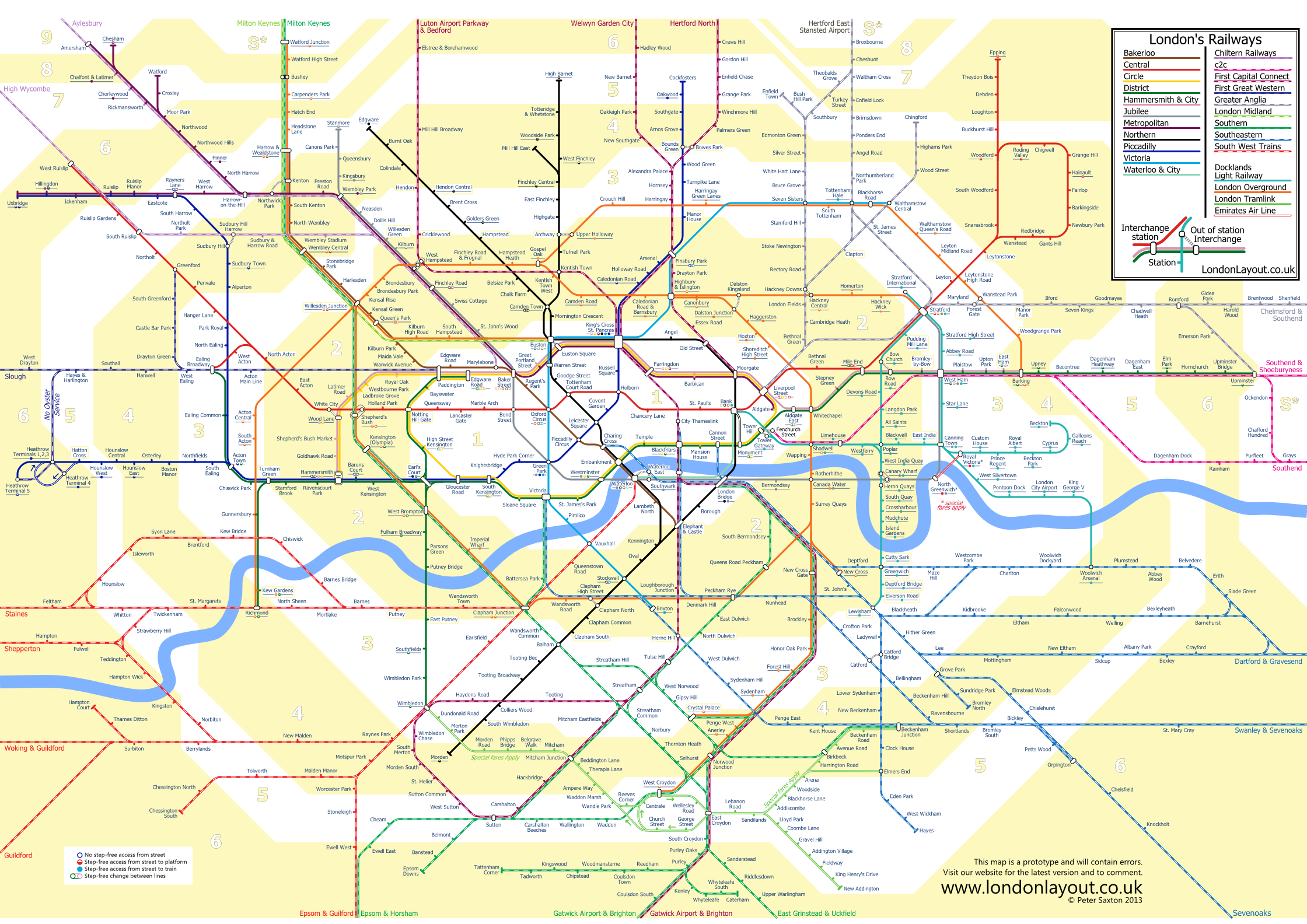
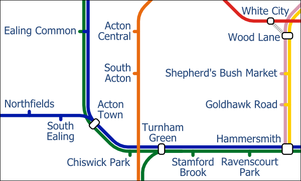
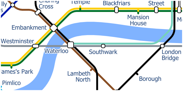
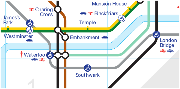
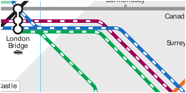
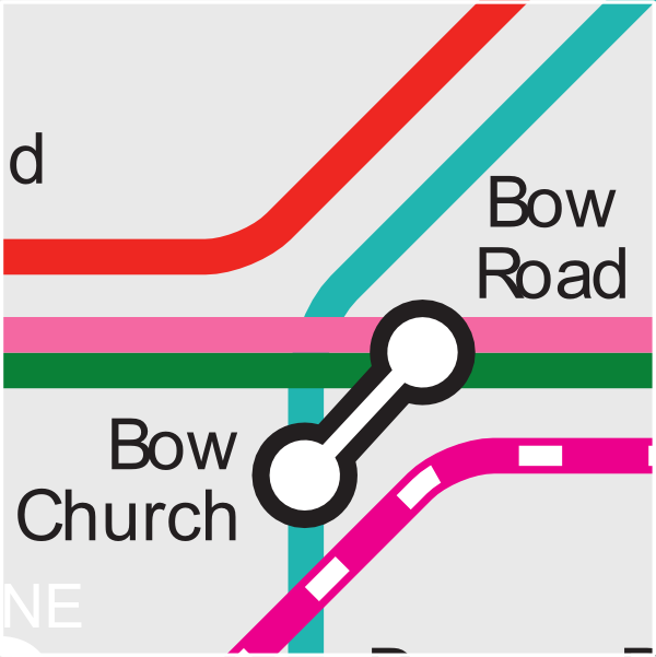
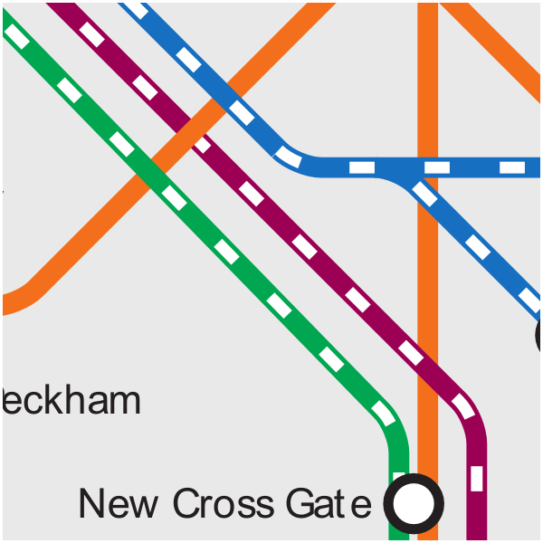
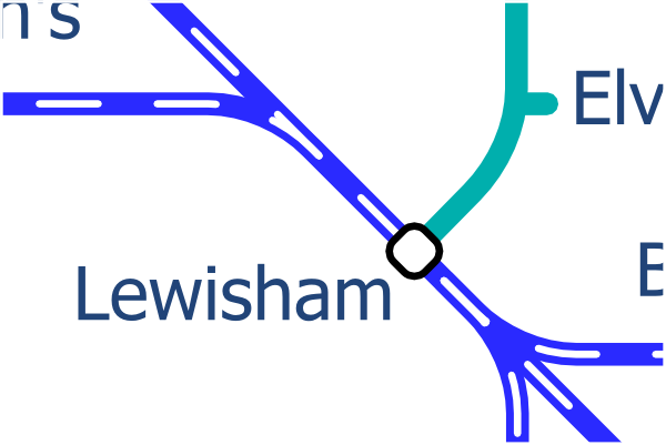
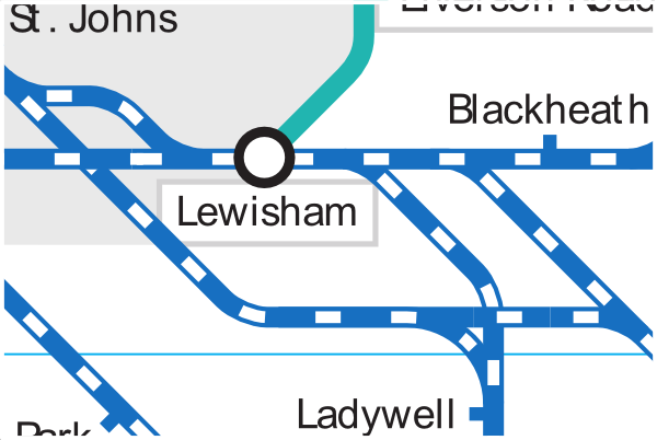
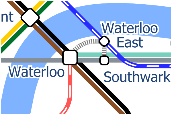
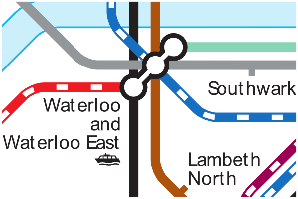
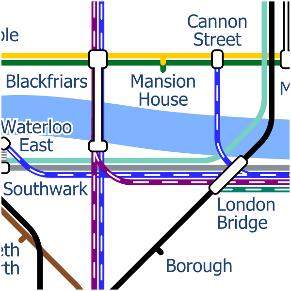
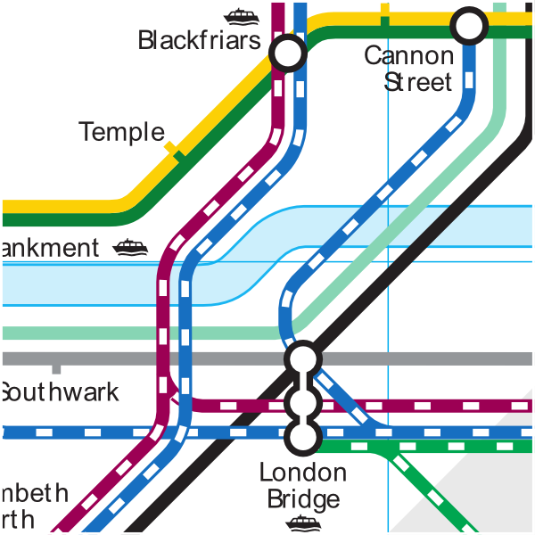
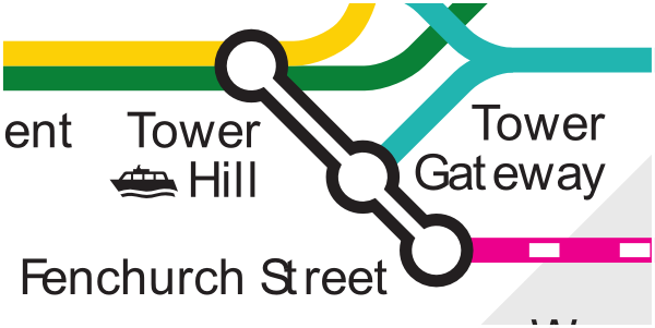
A fresh map for London's tube and rail network designed by an enthusiastic and frequent user.

The original London underground map is a clear design classic as well as an icon for London. In the years since it's inception the official map has become cluttered from subsequent updates. London Layout is a fresh new visualisation of London aspiring to capture the clarity of the original for the extensive modern network.


With thanks too • • Ian Sleeman • • Sir King Robert the Marvellous of Heathshire MPhys BSc • • Chris Marsh • • James Clark • • Michael Brown • • Simon Tucker • • @foundingadvisor • • Katie Douglass • • Susann Z

Maps

Maps for London transport, covering EVERY rail station accessible by Oyster Card. Also showing zone boundaries and key out of station interchanges.

Mission

The mission for London Layout is to be an invaluable and stylish tool for navigating the railways of London. The absolute priority for design clarity extending beyond the map to all the information it presents.

The development is currently focused on getting a complete set of live data feeds, e.g. extending live departure times to National Rail services. Adding accesibility information for a greater percentage of stations. As well as populating our database of local information.

London Layout is currently gathering funding through a Kickstarter campaign. This campaign is to encourage engagement in the project and to fund the development time required to reach our objective of having both digital and printed pocket sized versions of the map. This is the second campaign I have run on Kickstarter. The first campaign was a great success in helping to develop the map to its current form. The prompt delivery of all rewards shows that I am committed and able to deliver this project.

sample of alternative map showing design stlye

Comparison

Historic Anomalies

As new underground lines have been built they have been fitted to the existing map. Over time this has led to the position of new lines becoming more inaccurately represented to the point of being misleading. On a geographic map Westminster, Waterloo, Southwark and London Bridge run on a near east-west line, however the official tube map shows Waterloo well to the south of Westminster.


Inconsistent line separation

The official map is inconsistent on how lines are separated. In this example all the lines from London Bridge run along the same track bed. However they are randomly grouped with First Capital Connect services (purple) separated from the others.


Misleading stations

Here Highbury and Islington station is marked by two connected circles suggesting a substantial walk between lines, because in other parts of the official map this symbol is used to represent connections between two different stations. However at Highbury and Islington there is a cross platform connection between the Victoria line (blue) and First Capital Connect services (purple). Thanks to Geoff at stationmasterapp.com for use of his station layout images.


Interchange between stations

Here is an example of two stations joined by the interchange symbol that are distinctly separatated. Bow Church and Bow Road are separated by about 0.2 miles. The use of the regular interchange symbol makes it unclear that there are two different stations. It is most effective to show out of station interchange by a new symbol as seen in the alternative map.


Alternative design for rail lines around New Cross
London Tube and Rail map showing rail lines around New Cross

Unnecessary weaving of lines

The official maps follow no rules on the layering of lines passing over each other. The result here is the Overground line (orange) passes over and under a single grouping of lines. On London Layout maps routes which consist of fewer lines always pass over routes with more lines so that it is easier for the eye to follow.


Simplified Design for suburban rail lines around Lewisham station
Official Tube and rail map showing suburban rail lines around Lewisham station

Information Pollution

The track around Lewisham station is complicated and the official tube and rail map has attempted to represent this complexity in its design. The fact that some trains pass around the station is equivalent to some services travelling non-stop through the station. This extra clutter is not useful information as knowledge of surburban services will tell you to check the stations that the service is calling at.


London Layout map showing alternative interchange symbol to better represent the Waterloo station complex
TfL tube and rail map showing connections at Waterloo station

Waterloo and Southwark

This is the worst example of misleading stations using the existing interchange symbol. The current design necessitating that Waterloo and Waterloo East are combined into one messy interchange symbol. To make matters worse when changing from the Jubilee line to Waterloo East it is best to change at Southwark which is shown as a completely separate station, with no indication of a possible link. The use of simplifed stations and the out of station interchange symbol makes it much clearer which line belongs to which station on the alternative map.


Alternative map of West Croydon Station
TfL map of West Croydon Station

West Croydon

This is another example of a poorly used interchange symbol in this case the Overground line (orange) runs to the symbol connector rather than a circle representing the station.


London Layout map of Blackfriars Bridge station over river Thames
Official Tfl map of Blackfriars Bridge station over river Thames

Blackfriars Station

Blackfriars station is now built over the river with entrances on both sides. This means that you can exit north or south of the river and as the river is shown on the map this has necessitated an individual take on the station symbol. On the official map it does not appear that Blackfriars station is even on the river bank. London Layout introduces an extended symbol for the station to show it crossing the river


London Layout map of Tower Hill stations
Official TfL map of Tower Hill stations

Tower Hill stations

The stations around Tower Hill have been grouped to a single interchange symbol on the official map when in fact there are three distinct stations. Interchange between these stations is very important and needs to be shown. The introduction of the out of station interchange symbol again offers the advantage of showing three distinct stations.


London Layout map of Stratford station
Official TfL map of Stratford station

Stratford

A poorly laid out station on the official London Tube and Rail map. Here is an example of a single station this time spread out over a larger interchange symbol. These nodes offer no relevent information about the layout of Stratford station and so is better represented as a consolidated station as done on the alternative map.


Help

List of all controls and features on the London Layout interactive map.

Map Controls

Pan Map
Click and drag on the main map area to pan over the map
Zoom
Zoom using mouse wheel
optional - holding ctrl click and drag up to zoom in
Stations
Click station name to load to console top input
Double-click station name to load to console bottom input
Network routes
Click route to show line operator/line name

Shortcut Keys

Z: Zones
Press 'Z' to toggle zone outlines on and off
T: Tube only
Press 'T' to show/hide National Rail Lines
F: Fit to screen
Press 'F' to zoom map out to fit window

Navigator

Zoom +/-
Plus/minus to zoom in/out

Console

Live Departures, Station Information, Find
Click twice to show information for second station
Incidents
Select to show/hide key and live information
Live Departures
Select fetch live departures from station
Station Information
Select to show/hide station information
Directions
Time averaged route recomendation's are being developed
Find
Click to locate station's entered in search bar

Copyright

Copyright notice:
© Peter Saxton 2013
The Londonlayout design is protected by copyright; no part of this map may be reproduced without the express permission of the copyright holder.
petersaxton@londonlayout.co.uk
Please note that any unauthorized use of the Londonlayout design is an infringement of intellectual property and may lead to legal action and other remedies permitted under the Copyright Design and Patents Act 1988.


Disclaimer:
This map is not in anyway associated with Transport for London. The information is correct to the best of our knowledge at the time of publication however no liability for mistakes within the content will be accepted